
Tasarım
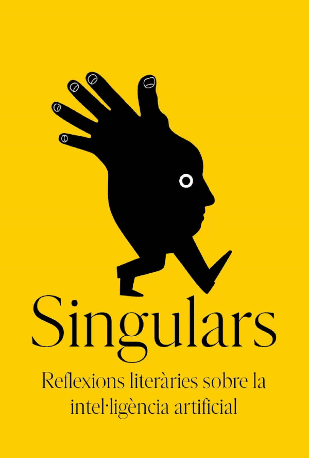
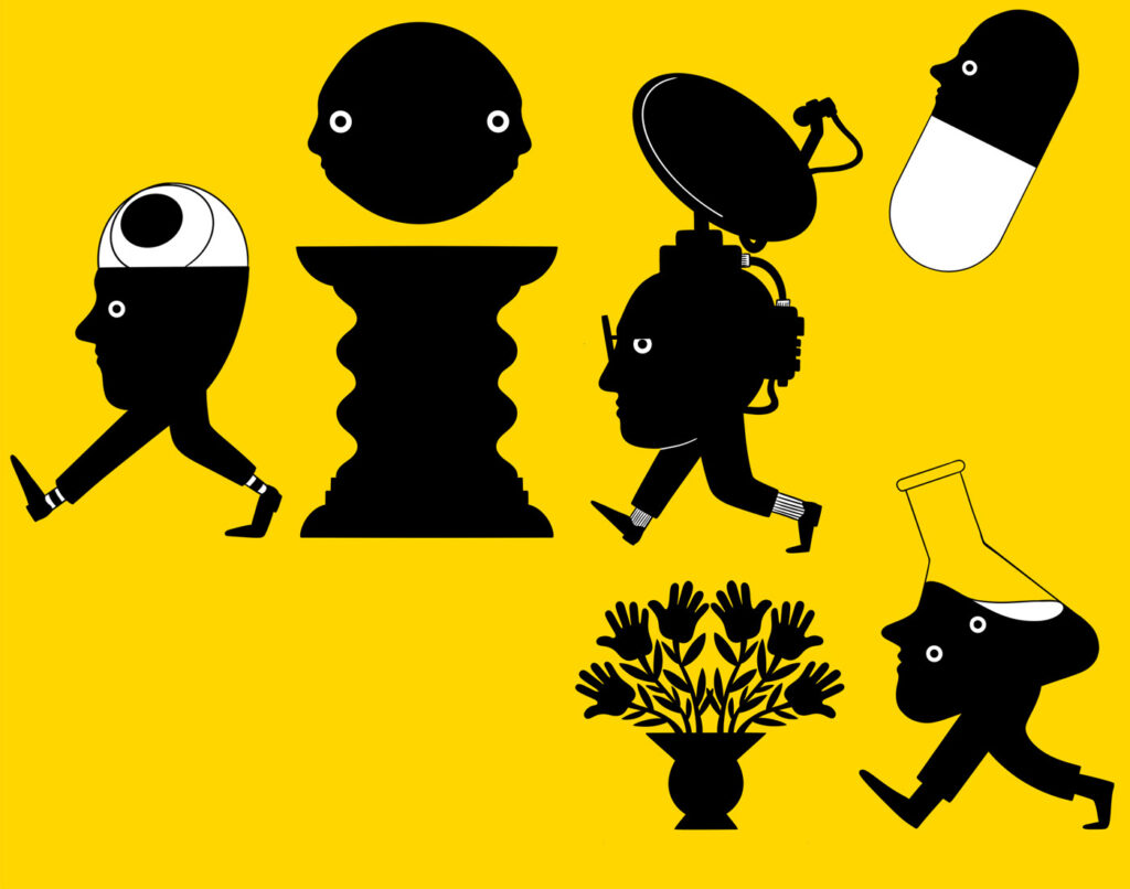
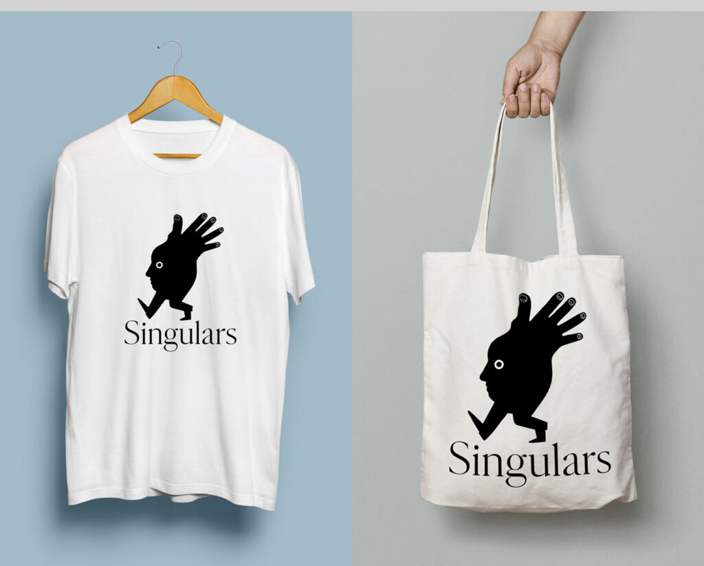
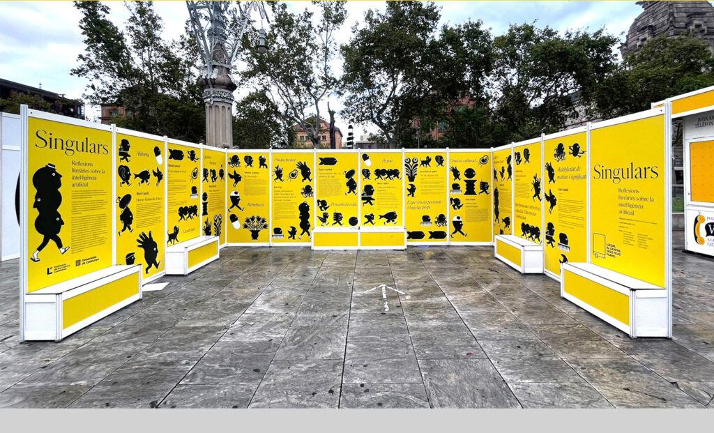
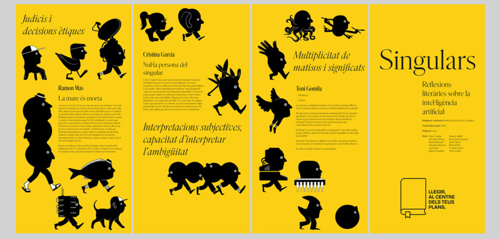
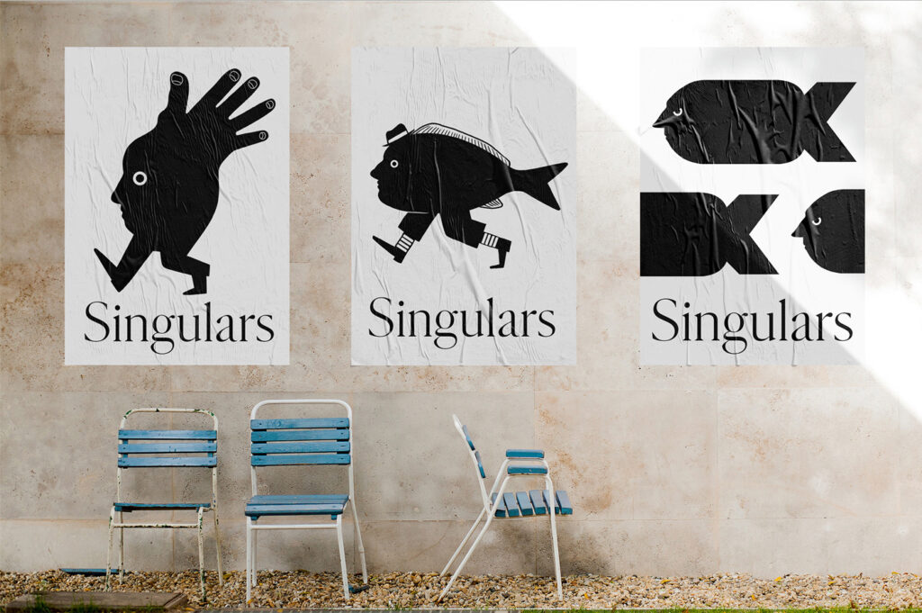
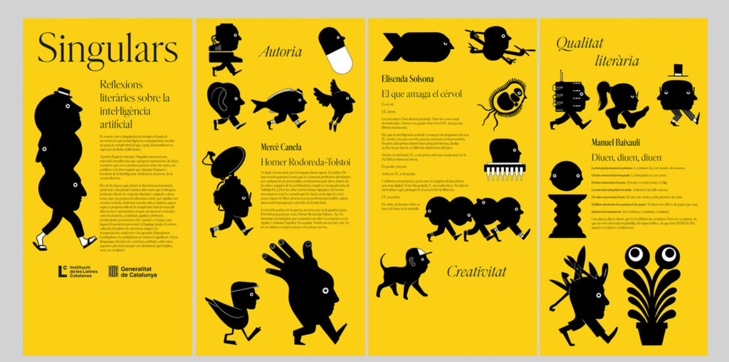
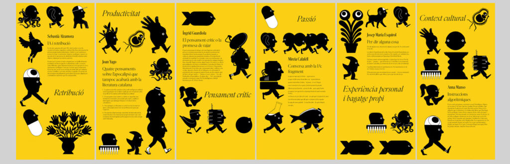
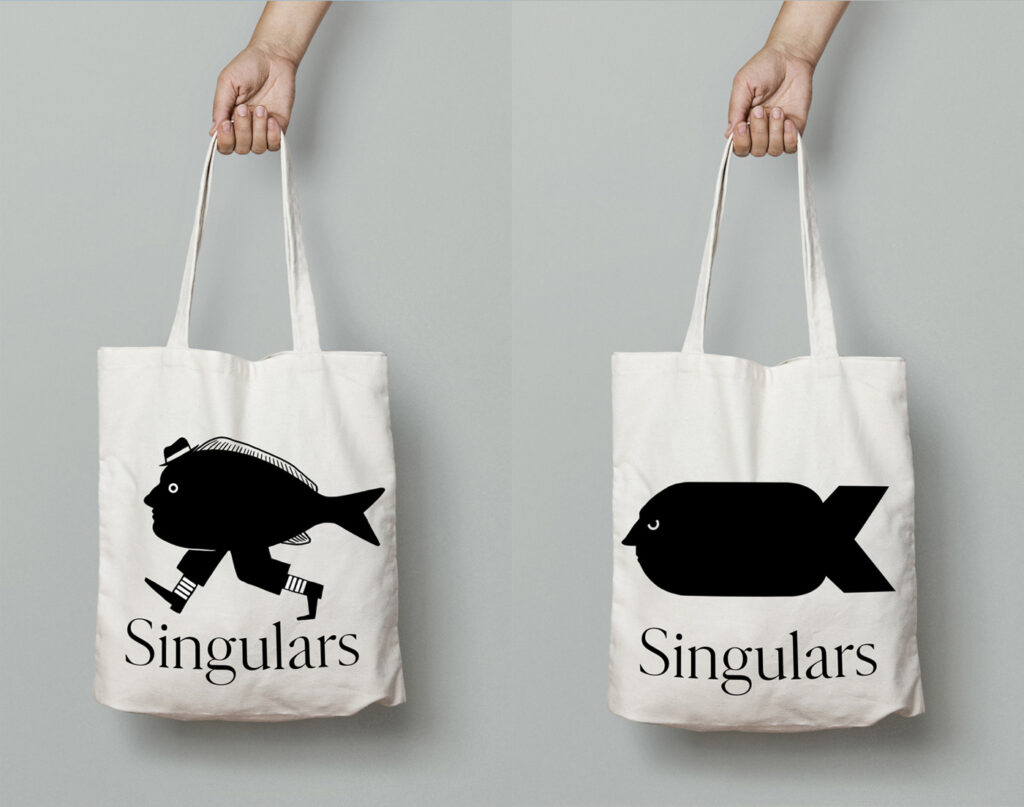
Singulars

Tasarım
Belgian Railway Company
Logo’nun yeniden üretimi için hazırlanan teknik dökümanı çok hoşuma gitti.
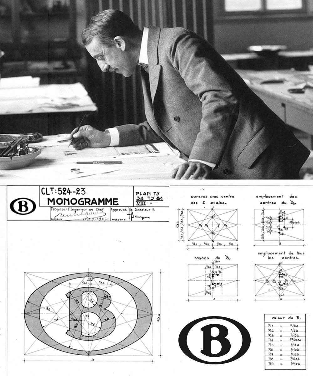
In December 1935, the Belgian railway company decided to organise an internal competition on Van de Velde’s proposal in order to design a more discreet and clearer logo to identify the railway. However, as one knows from files and records from this time today, this competition did not bring a satisfactory result.
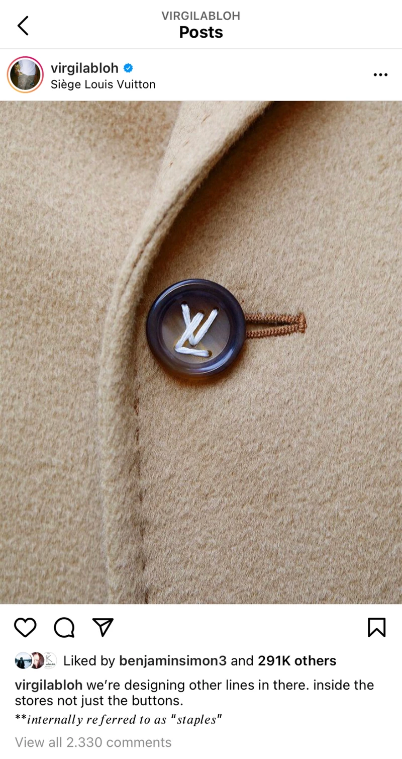
Yeni gördüm.
Hayat anlamlıymış gibi görünen anlamsızlıklarla dolu. Bu da onlardan biri.
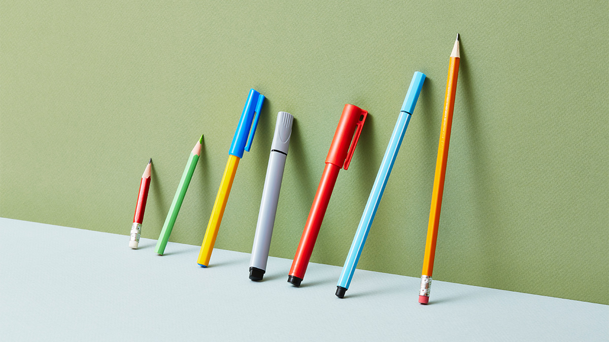
HBR’da gördüm. Görsel olarak çok tatmin edici.
Sanki derin bir sembolizm var gibi ama tam olarak ne diyor? Chart..
Coca-Cola kırmızısı beynimizde.

Iroko

Ladin

Köknar

Çam


-

 Oyun8 yıl önce
Dolar 3,79TL • Euro 4.70TL • Bitcoin 42.179TL olmuş
-

 Sanat8 yıl önce
Mina Başaran ve arkadaşları uçak kazasında ölmüş
-

 Tasarım8 yıl önce
Romanyalı adam yaşadığını mahkemeye ispat edemiyormuş.
-

 Eğlence4 yıl önce
The Mitchells vs the Machines
-

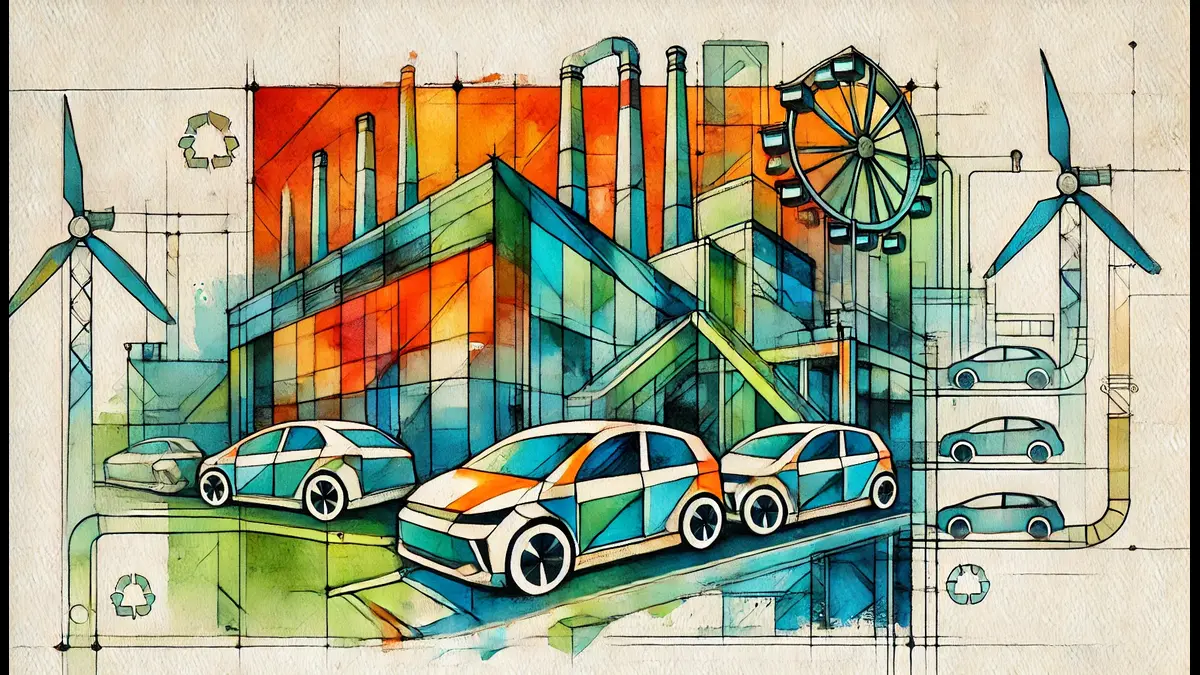
 Otomobil8 yıl önce
Mark Zuckerberg, Cambridge Analytica olayında hatalı olduklarını kabul etmiş.
-

 Otomobil8 yıl önce
Challenger uzay mekiğini Nakşibendi’ler düşürmüş
-
 Sanat8 yıl önce
İstanbul’da sis bugün de devam edecekmiş
-
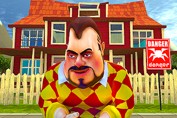
 Oyun4 yıl önce
Dark Riddle: Scary Neighbor